Visual identity

Hello, Good evening!

Thanks you for those who are following my blog and liking my posts. This evening I’ve been working on something very different – my own visual identity. For those who don’t know what it is, visual identity is the business identity such as logo and business cards.

visual identity is the visual and verbal articulation of a brand or group, including all pertinent design applications, such as letterhead, business cards, and packaging, among many other possible applications. It may also include a tagline (or brandline) and advertising.

When creating your own business card you need to think of the viewer. Since you will be giving it out to people, you need to make sure it’s clear and readable. Us designers love our font size to be very small and clean but, this can sometimes be a problem because people need to be able to read it.

Usually the information that you will find on the business card is:

—> Name

—> Job title

—> Email

—> Website

—> Phone Number

IMG_7100
This is part of the different designs i’ve come up with tonight. Originally I designed 2 front designs and 10 back designs. I’ve condensed it down to 5 for the purpose of the photo.

Continue reading Visual identity

Secret 7 Exhibition

IMG_6855 IMG_6856On Friday I had the pleasure to go to see the chosen 700 music vinyls. I must say I was very surprised with the amount of designs that were made in 3D. A lot of them were quite different and abstract, where as others  were very easy to guess who the artist of the song was. I was very fascinated with the outcome of this exhibition,  and glad to have made it on time to see the lovely work.

IMG_6857  IMG_6865 IMG_6861 IMG_6859 IMG_6858

Somerset House – Pick Me Up

IMG_6818 IMG_6819

From my last visit to Pick me up exhibition in Somerset house I left the place feeling so inspired. Pick me up is an exhibition that selects the work of 13 international up and coming illustrators and graphic artists who have graduated or set up their own studio within the last three years.

What I loved the most was the typographical work. It’s one of many reasons why I decided to go, after reading about this exhibition in Creative Review. I am very fascinated about type and distortion.

IMG_6825 IMG_6826 IMG_6828 IMG_6834


On my way around the exhibition I was pleased to find that the artist I featured in my Grafik Takeover Magazine George Douglas had his work in the exhibition. George Douglas is based in Edinburgh currently on his final year at Edinburgh University. His work is collage based and he loves playing with found images from magazines.

IMG_6830

From plan to action – Final Major Project ABC flip-books

For a while now I’ve had in mind that I should make these mini flip books to give away at the final year show. The last couple of days have been spent planning and making these flip-books. I must admit I have changed the plan. My initial plan was to create about 25-50 flip books.

  • The content for the flip book will be from the animation in the beginning of my video.
  • These books will be limited edition – which means they will be different to the animation from the video.
  • Each book will be different. Could be the cover or the colour.
  • The books will have either an A, B or C shaped inspired by the typography of my burning question poster.
  • The front cover of the book will be stamped using the same type as the video.
  • Each book will have up to 20 pages.

After creating one book, I realised that my plan was unrealistic because It was very difficult to create that amount of copies in a very short amount of time. However, instead of giving away the ABC books I decided that these will be part of my video along with a poster. What will be interesting is that each word from the video will be swapped with another word that best describes it. For example, in my first book ‘Employment’ gets replaced by ‘disappointment’. I believed that this will be really striking because it will be provocative. My idea is to show the viewer the truth about the education system.

IMG_6936IMG_6937


Creative process grows in imaginative minds

blog scan0153
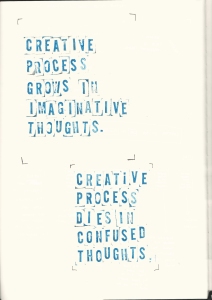
This message can be interpreted in many different ways. It could be an inspirational quote ‘Creative process grows in imaginative minds’ however in this video, the purpose is to show the reality about the education system. We will see two different perspective views throughout the view. Keeping more to the reality, ‘Creative process dies in confused minds’ will be a replacement at points.

Music

Music is possibly the most important element of this video because it is what withdraws the attention of viewers. A simple way to make sure the right to use an artist song is granted is by visiting free commercial websites.

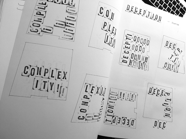
I’ve tried to think about ways of adding interesting sounds, for example while type is moving or disappearing. I believe this will make the video more interesting and exciting visually. In my previous post there are some photos of type animation that I’ve created. As each letter appears and moves in the frame, a sound of a clock ticking will appear. The reason why the clock sound works for this is because it creates suspense and excitement about what will happen next.
blog_Screen Shot 2016-04-23 at 20.00.41 copy
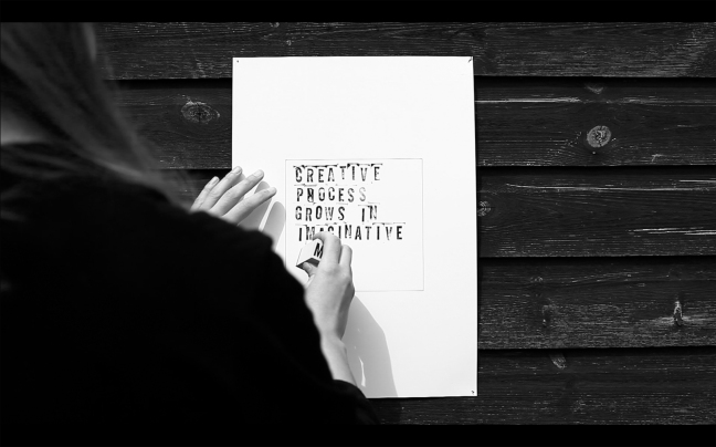
Screenshot from the video of myself stamping a message.

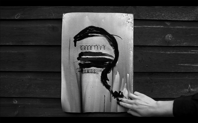
After showing this video to my studio, I got really nice and useful feedback on how to push this idea further. One of the suggestions was to leave it outside for the rain to destroy the paper. I’ve gone a slightly different direction by using black watery block paint instead because after trying to spray the paper with water it would not show much results. The letters did get a little bit runny black ink but that was the most I could get out of them.

In the photo underneath, I experimented with spraying the poster black and then letting the ink drain on the floor. There was a little bit of black ink left in the container, so I had the idea of covering the words that are not important. ‘Creative minds’ were the only words left, creating a question mark around the words made it look interesting. At the same time the question mark looks like the head of someone which related to the words.
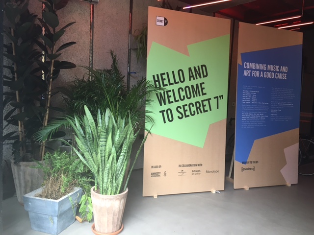
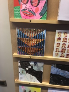
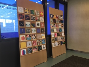
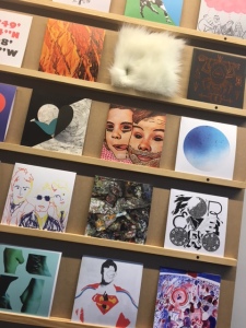
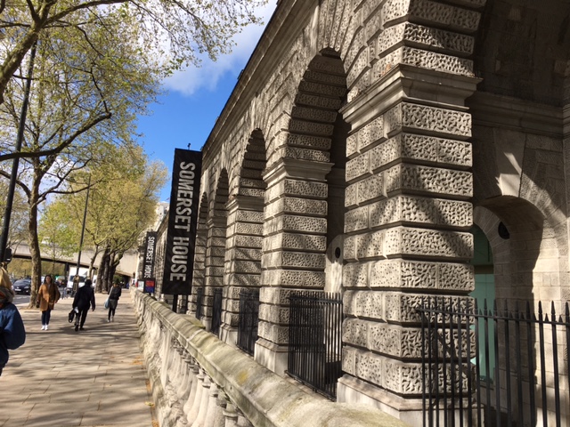
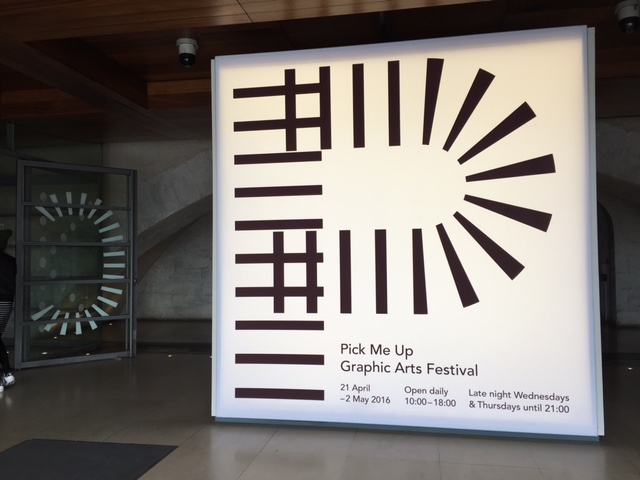
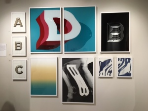
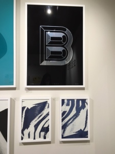
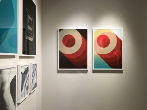
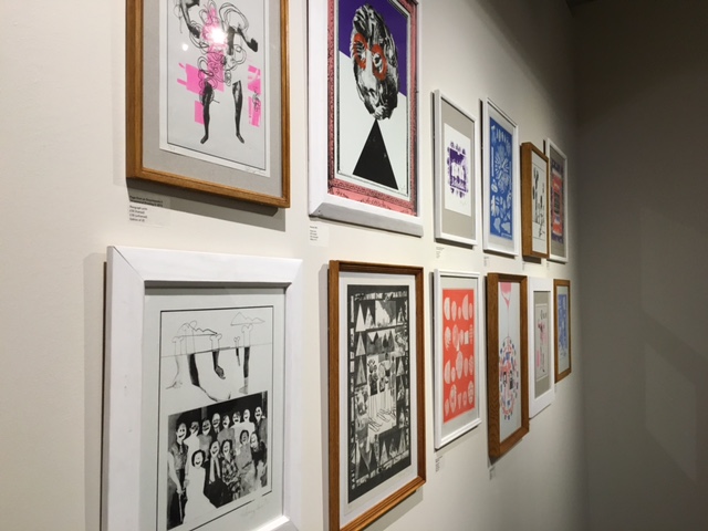
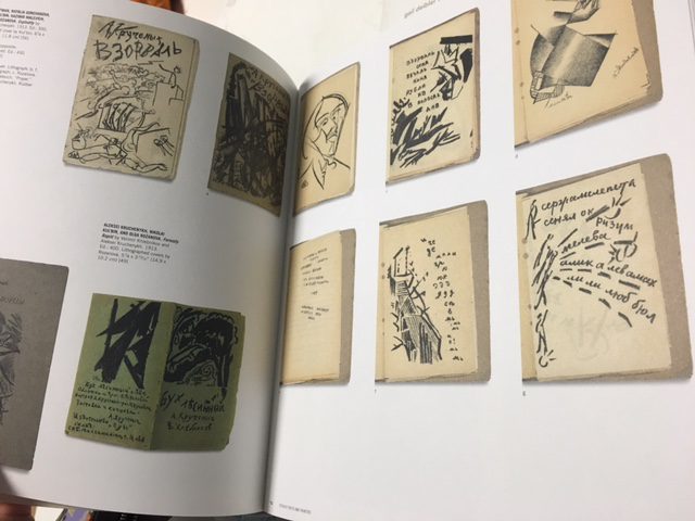
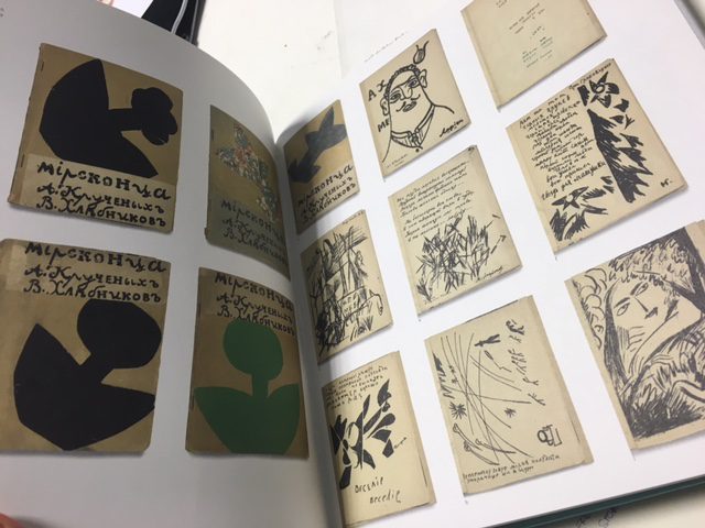
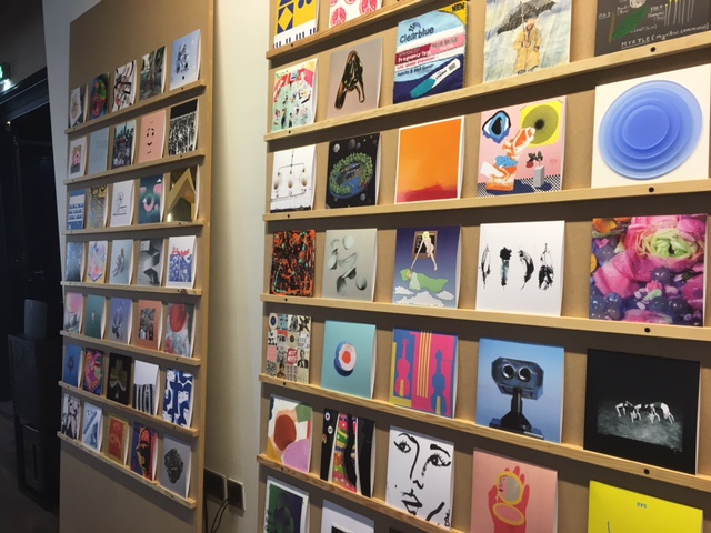
blog_Screen Shot 2016-04-23 at 19.33.20 copy

Penguin Books Competition 2016

For the first time this year I took part in the Penguin books competition. There were three routes to choose from – Adult Fiction, Adult Non-Fiction and Children’s Cover. I decided to choose the children’s cover – Emil and the detectives because it’s a classic children’s story by Erich Kästner. Straight away after reading the blurb I began to imagine the story in my head and was excited to illustrate this books.

‘After him! After him!’

Emil is excited to be going on a train all by himself, with money for his grandmother safely tucked into his pocket. But a strange man wearing a bowler hat is acting mysteriously, and soon Emil starts to feel sleepy…

The next thing he knows the man – and the money – have gone! Emil is determined to get it back and teams up with a gang of young detectives in a hair-raising chase across the city to catch the thief.

This is the existing Emil and the detective puffin book.
This is the existing Emil and the detective puffin book. Our job is to made this classic more modern looking.


IMG_7241
First step was to explore the characters and write down what role they play in the book. Then start to draw important events from the story.
After visiting Waterstones and having looked at existing penguin books, I decided that it is important to have handwritten type. I explored different font styles until I was happy with one.

In order to understand the story more, I have purchased the book and will be reading it as well as watching the movie from 1964.


The Russian Avant-gard

IMG_3115
The Russian Avant-garde book 1910-1934.

This catalogue accompanies an exhibition that celebrates a gift to The Museum of Modern Art, New York, of a comprehensive collection of Russian avant-garde books produced between 1910 and 1934. The exhibition includes over 300 books designed by such artists as Kazimir Malevich, El Lissitisky, Aleksandr Rodchenko and Natalia Goncharova. The catalogue includes over 600 colour illustrations of these remarkably diverse books, which were often collaborations between artists and poets; essays written by Deborah Wye, Margit Rowell, Jared Ash, Gerald Janacek and Nina Gurianova; a checklist of the more than 1,200 items in this historic gift; and a comprehensive bibliography and index. The literal English translations of some of the books are compelling enough: Drunken Cherries, Tango with Cows: Ferro-concrete Poems, Lacquered Tights, Melancholy in a Robe, As Simple as Mooing, Secret Vices of Academicians, A Head Alone is Prone to Moan and Moans Because It Is Alone, A Little Duck’s Nest…of Bad Words. The subject matter is wide and varied, from Judaica to children’s books. The original works were produced in limited print runs or from a few hundred to a thousand copies.

Many were hand made, hand printed and had the art hand stamped.

IMG_3114
My teacher Bill Brown brought this book in for us to see. He purchased this book from an exhibition in New York. The simplicity of the artwork is very striking.

IMG_3113 IMG_3112 IMG_3111 IMG_3110

The London Illustration Fair goodies

IMG_2996
I have recently purchased these books and print from The London Illustration Fair. The book on the right has hundreds of screen print pieces of work made by well known artists. The reason why I selected these books was because I am very much interested in all kinds of print methods and I wanted to get some inspiration from these books.
IMG_2997
The book on the left ‘Adventures in Letterpress’ focuses mainly on type and shows you how to use the letterpress machine. It also has some examples of work.