From plan to action – Final Major Project ABC flip-books

For a while now I’ve had in mind that I should make these mini flip books to give away at the final year show. The last couple of days have been spent planning and making these flip-books. I must admit I have changed the plan. My initial plan was to create about 25-50 flip books.

  • The content for the flip book will be from the animation in the beginning of my video.
  • These books will be limited edition – which means they will be different to the animation from the video.
  • Each book will be different. Could be the cover or the colour.
  • The books will have either an A, B or C shaped inspired by the typography of my burning question poster.
  • The front cover of the book will be stamped using the same type as the video.
  • Each book will have up to 20 pages.

After creating one book, I realised that my plan was unrealistic because It was very difficult to create that amount of copies in a very short amount of time. However, instead of giving away the ABC books I decided that these will be part of my video along with a poster. What will be interesting is that each word from the video will be swapped with another word that best describes it. For example, in my first book ‘Employment’ gets replaced by ‘disappointment’. I believed that this will be really striking because it will be provocative. My idea is to show the viewer the truth about the education system.

IMG_6936IMG_6937


Creating the right dust jacket for my manifesto

For a while now I’ve had in mind that my manifesto needs a dust jacket, handmade off course!

Because my manifesto was created to show that designers do make ideas and design on paper rather than work from a screen all day. I’ve been sketching a few ideas of how I want this dust jacket to look like. Firstly it will be created using letter stamps which reflects on the content of the book itself.

IMG_6775
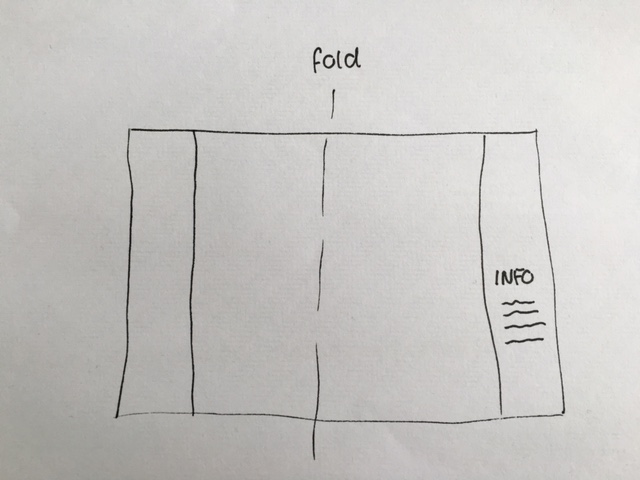
In this photo on top, it shows the layout for dust jacket. There will be a small description of the book on the last page as shown in the photo. It’s very important that people know what this book is about.

IMG_6774


There are 2 types of paper that I want to experiment with. I have brown paper that is quite nice to give a craft feel as well as a vibrant neon pink that I have been using since commencing this project. The only problem that I may experience with the pink paper is that due to its glossy finish the ink may not stick on to the paper. As shown in the photo, I have stamped it to experiment whether or not it will dry out. I will leave it a few hours before attempting touching it. The advantages of using roll paper is that it will be very easy to create my dust jacket as size is not limited to printer since letter stamps will be used.

13120626_1617328571926536_1769978865_o

Saddle stitching with thread for the first time using very simple equipment

For a while now, bookbinding has been something I’ve wanted to try out but felt it was difficult. After watching a  video tutorials I felt it was easier than I thought and it’s possible to do this without spending any money. For this type of zine IMG_6098
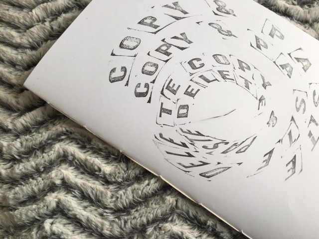
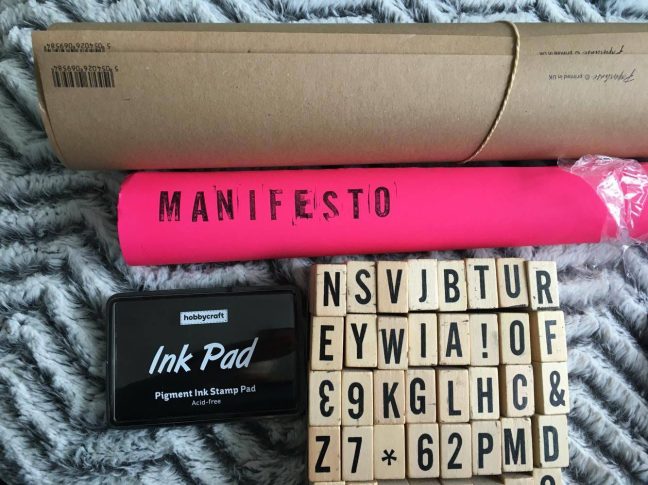
I’ve decided that saddle stitching is the neatest and more successful option. The equipment I used was:

  • Black crochet thread
  • 4 Clips
  • Scissors
  • Ruler
  • Pencil to mark
  • Extra thin awl

From this experience I’ve learnt that trying new options can pump up the quality of your work. As well as give you ideas for future projects and inspiring fellow students. IMG_6102 IMG_6107 IMG_6114 IMG_6150

‘Am I convincing?’ Poster has been featured in Ficciones Typografika

13047815_1072804706073650_4888846301167617979_oJoana SantosAndrew SosnowskiMichael Ahrain, Ficciones Typografika 1162-1164 (72”x36”). Installed on April 17, 2016. “Burning Questions” by students from Press Pass Studio led by Angharad Lewis and Sarah Boris at The Cass, London Metropolitan University. More: http://ficciones-typografika.tumblr.com/

This poster ‘Am I convincing’ has been created to answer some of my burning questions, as a final year university student a lot is in my mind. To start off, these burning questions began growing when I started doing research for my dissertation, which, is about whether university guides and supports students through a successful career path.  I knew that the education system was made in a way that it does not support children’s intelligence. According to Ken Robinson when children are very young, education is not helping them develop their creativity because they are being forced to pass academic subjects, such as English, Maths and Science rather than being educated. More about this topic will soon be uploaded on to my dissertation link.

13063227_1072804752740312_1006311047245439386_o

The evolution of my burning question.


blogevolution of burning question_2


From Sketching to scanning to print making.

It’s been a long journey, but the question still remains. Am I convincing?

To make the question even more interesting I have decided to explore my burning question using different print methods. So we was given a brief at week 3 to produce a poster design that best expresses my burning question. Firstly I wanted my question to be hard to read which relates to the question itself. I explored different printing materials because I felt it would help me understand the question and perhaps answer it eventually. Paper, texture, ink, colour choices.. It became fun to produce these posters. In fact it gave me a greater chance of understanding the question and hopefully get some answers. At times it felt as if i was answering my burning question. By that i mean, how far can I push this idea. Am I happy with it? Shall I try something new? Shall I screen print it? Or shall I spray paint it? What colour to use? What paper texture and so on..

Continue reading The evolution of my burning question.

Am I convincing? Poster Process

dev photos-poster process1

These are a few of many steps to creating my poster. Initially I was very confident about the final outcome. I knew exactly what I wanted my final outcome to look like. However, as things never turn out the way we expect, of course we encounter some issues. One of the problems that I experienced was with the stencil. Between the letters the gap was extremely small, so a few did rip. I didn’t see this issue as bad as it was because i thought about ways to overcome the issue. One of the advantages was that once I layered the stencil it was possible to correct it.

IMG_1832Press Pass Studio Posters.